Ever wondered why some landing pages effortlessly convert visitors into customers while others don’t? The secret lies in landing page design, a strategic blend of psychology and aesthetics. A well-designed landing page doesn’t just look good; it taps into human behaviors, emotions, and cognitive patterns to guide visitors toward taking action.
Let’s explore how effective landing page design influences user behavior, improves user experience, and boosts conversions.
How Landing Page Design Impacts User Psychology
Visual Hierarchy Directs Attention
Your visitors scan before they read. Landing page design leverages visual hierarchy to guide eyes naturally from one important element to another.
- Headlines: Large, bold headlines instantly capture attention.
- Images: High-quality visuals reinforce the message and evoke emotions.
- CTA Buttons: Prominent buttons clearly signal what action to take next.
Color Psychology Influences Emotion
Colors evoke specific emotions and drive user behavior. Choose colors purposefully:
- Red: urgency, excitement (ideal for sales and offers)
- Blue: trust, security (excellent for finance or tech companies)
- Green: calm, growth (great for health and wellness brands)
White Space Enhances Clarity
Whitespace isn’t wasted space; it’s breathing room. Proper use of whitespace:
- Increases readability
- Reduces cognitive overload
- Makes key elements stand out
Elements of High-Converting Landing Page Design
Clear and Compelling Headlines
The headline should instantly communicate value. Make it concise, benefit-driven, and intriguing enough to encourage further reading.
Strong, Persuasive Copy
Good landing page design includes copy that’s concise, clear, and persuasive:
- Use bullet points or numbered lists for clarity.
- Speak directly to the visitor, addressing pain points and offering clear solutions.
- Highlight benefits rather than just features.
Trust-Building Elements
People convert when they trust you. Include elements like:
- Testimonials
- Reviews
- Certifications or badges
Powerful, Action-Oriented CTAs
Effective CTAs are:
- Clear and direct (“Buy Now,” “Download Free Guide”)
- Prominently positioned
- Visually distinctive through color or contrast
Common Mistakes to Avoid in Landing Page Design
- Too Many Choices: Decision paralysis occurs when visitors face too many options. Limit choices to guide users clearly.
- Slow Loading Speed: Slow pages lose visitors quickly. Optimize your images and scripts to ensure rapid loading.
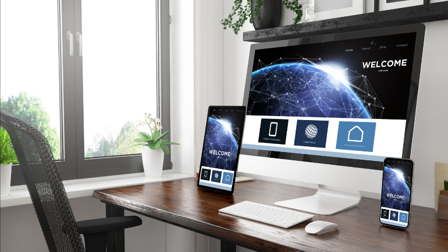
- Mobile Unfriendliness: Many visitors access landing pages via mobile devices. Ensure your design is responsive and mobile-optimized.
Putting It All Together: The Perfect Landing Page
An effective landing page combines thoughtful visual design, persuasive copywriting, and a clear understanding of user psychology. Remember:
- Design for clarity and ease.
- Understand and leverage color psychology.
- Reduce cognitive load with whitespace.
- Clearly state your value proposition.
Conclusion
Mastering the psychology behind landing page design helps you create pages that truly resonate with your visitors. Focus on clarity, emotional appeal, and user-friendly navigation to boost your conversions.
Ready to transform your landing pages into conversion machines? Start by reviewing your current designs today, optimizing elements based on psychological insights, and watch your conversions soar!