Let’s Start with This: Would You Click This Button?
Picture this: you’re interested in a service or event. You scroll down to take action, and then you see the button…
“Submit”
Does it inspire trust? Spark excitement? Give you a reason to click?
Probably not.
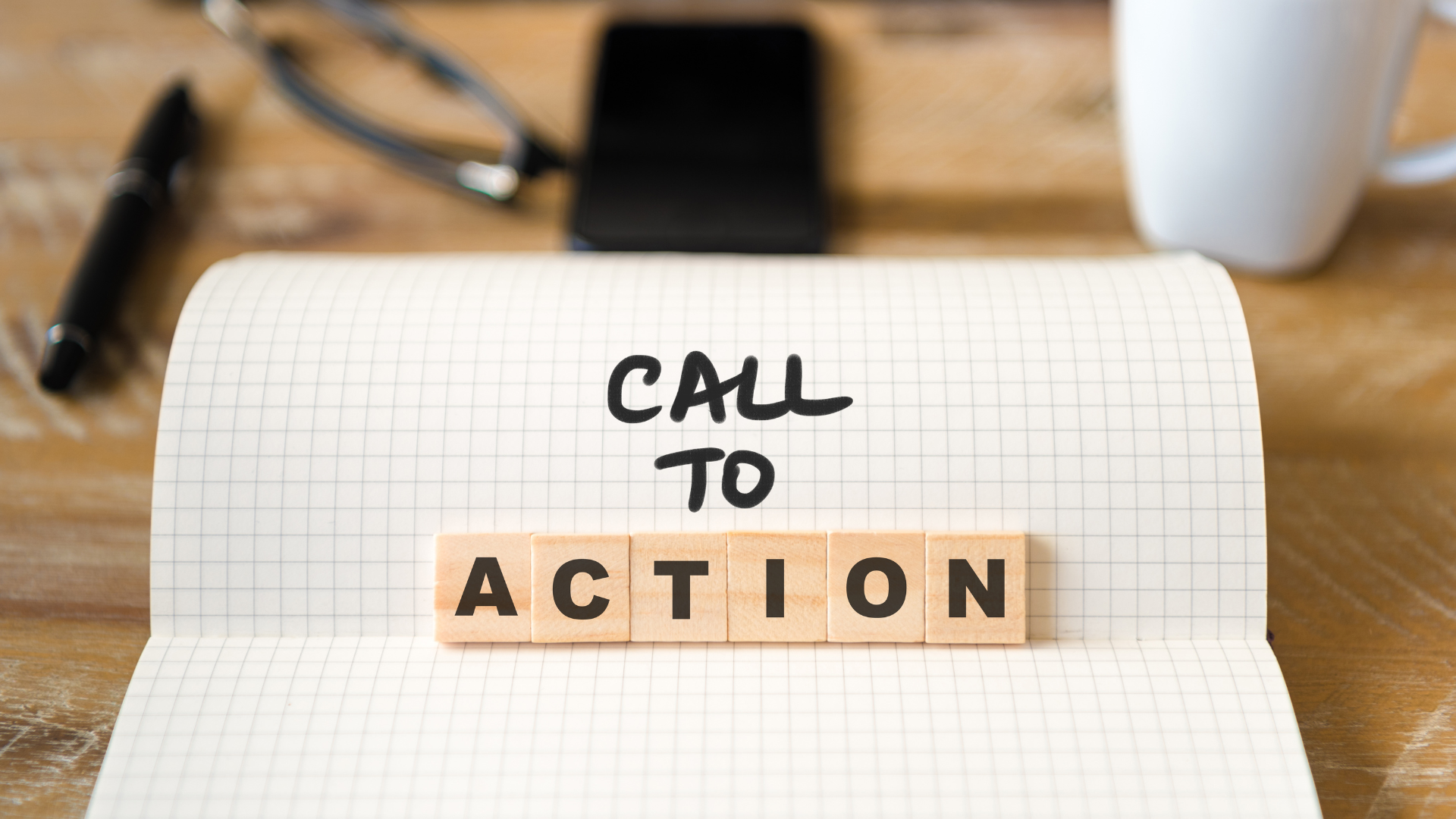
The CTA (call to action) is one of the most overlooked yet most powerful pieces of your marketing funnel. Whether you’re running a coaching business, selling tickets to a live show, or launching a SaaS product, your CTA is where interest becomes action—or falls flat.
This article shows you how to make sure it becomes action.
What Makes a CTA Work in 2025
Your CTA is the moment of truth. It’s where your copy, your offer, and your design all converge. But most CTAs fail because they forget three core truths:
- The user needs to know what they’re getting.
- They need to feel safe taking the next step.
- The moment must feel worth it—right now.
Let’s look at how to do all three, clearly and consistently.
7 Principles for Click-Worthy CTA Optimization

1. Speak in Human Language
Avoid cold, robotic phrases like “Submit” or “Learn More.” Replace them with language that reflects user intent and benefit.
Instead of:
“Submit” “Download” “Sign Up”
Try:
“Get My Free Guide” “Book My Spot” “Start the Trial Now”
The more the button reads like something they’d say out loud, the more likely they’ll act.
2. Make the Button a Reward, Not a Task
Users hesitate when it feels like they’re giving something. A great CTA flips the script—it offers them something.
Weak: “Download PDF” Better: “Get Your Free Event Toolkit”
Tell them exactly what they’ll get—and why it’s worth a click.
3. Use Social Proof Inside the CTA
You don’t always need a testimonials block. You can bake trust directly into the button.
Examples:
“Join 2,800 Founders” “Used by 1,200+ Event Planners” “Get My Access (Rated 4.9 Stars)”
This gives your CTA instant legitimacy and lowers decision friction.
4. Eliminate Risk in the Moment of Action
People worry about spam, getting charged, or wasting time. Remove those concerns—right at the CTA.
Add short statements like:
- No credit card needed
- Free and instant access
- Cancel anytime
- Only takes 60 seconds
These don’t belong in a long paragraph. They belong next to or below the button.
5. Design with Momentum, Not Decoration
Even the best CTA text won’t work if it’s hidden or bland.
Make it unmissable:
- Bold, high-contrast color
- Plenty of whitespace
- Visible on first screen
- Large enough to tap easily on mobile
If the user has to hunt for the button, you’re losing conversions.
6. Match Your CTA to Funnel Stage
Different users = different needs. A first-time visitor is not ready for “Buy Now.”
Top of Funnel:
- Explore the Lineup
- Watch the Demo
- Take the 2-Min Quiz
Middle of Funnel:
- Claim Your Discount
- Get a Free Ticket
- Compare Plans
Bottom of Funnel:
- Start My Free Trial
- Reserve My Seat
- Buy Access Now
CTA optimization only works when it aligns with user readiness.
7. Build a Simple A/B Test Plan
You don’t need complicated software. Just test these variables:
| Element | Option A | Option B |
| Copy Tone | “Let’s Go” | “Get Started” |
| Length | Short (“Join Now”) | Descriptive (“Join 2,300 Marketers”) |
| Visual | Flat color | With icon or arrow |
| Trust | No proof | With rating or user count |
| Friction Note | Not shown | Below: “No card required” |
Run for 5–7 days. Track CTR, not just clicks. Let your users vote with their behavior.
CTA Examples Across Industries
| Business Type | High-Performing CTA Example |
| Service Businesses | “Get My Custom Quote in 2 Minutes” |
| Event Organizers | “Book My Ticket for Saturday” |
| Online Education | “Start Your First Lesson Free” |
| Digital Products / SaaS | “Start Building – No Card Needed” |
| Retreats or Workshops | “Apply to Join the Guest List” |
Whether your offer is digital, live, or service-based—your CTA is your closer. Write like it matters.
CTA Self-Audit: Final Checklist
Use this to review your top 3 buttons right now:
- Is the benefit clear?
- Does it reduce friction or risk?
- Is it visually prominent?
- Does it match the funnel stage?
- Would I personally click it?
If any answer is “no,” you’ve got room for impact.