Two Health Experts, One Clear Guide
Creative e-book design that makes complex holistic health content easier to explore.
Project
Homeobiologika & Domivita
Timeline
January 2024
Location
Lodz & Wroclaw, Poland
Solutions
Creative Design
The Minds Behind the Wellness Guide
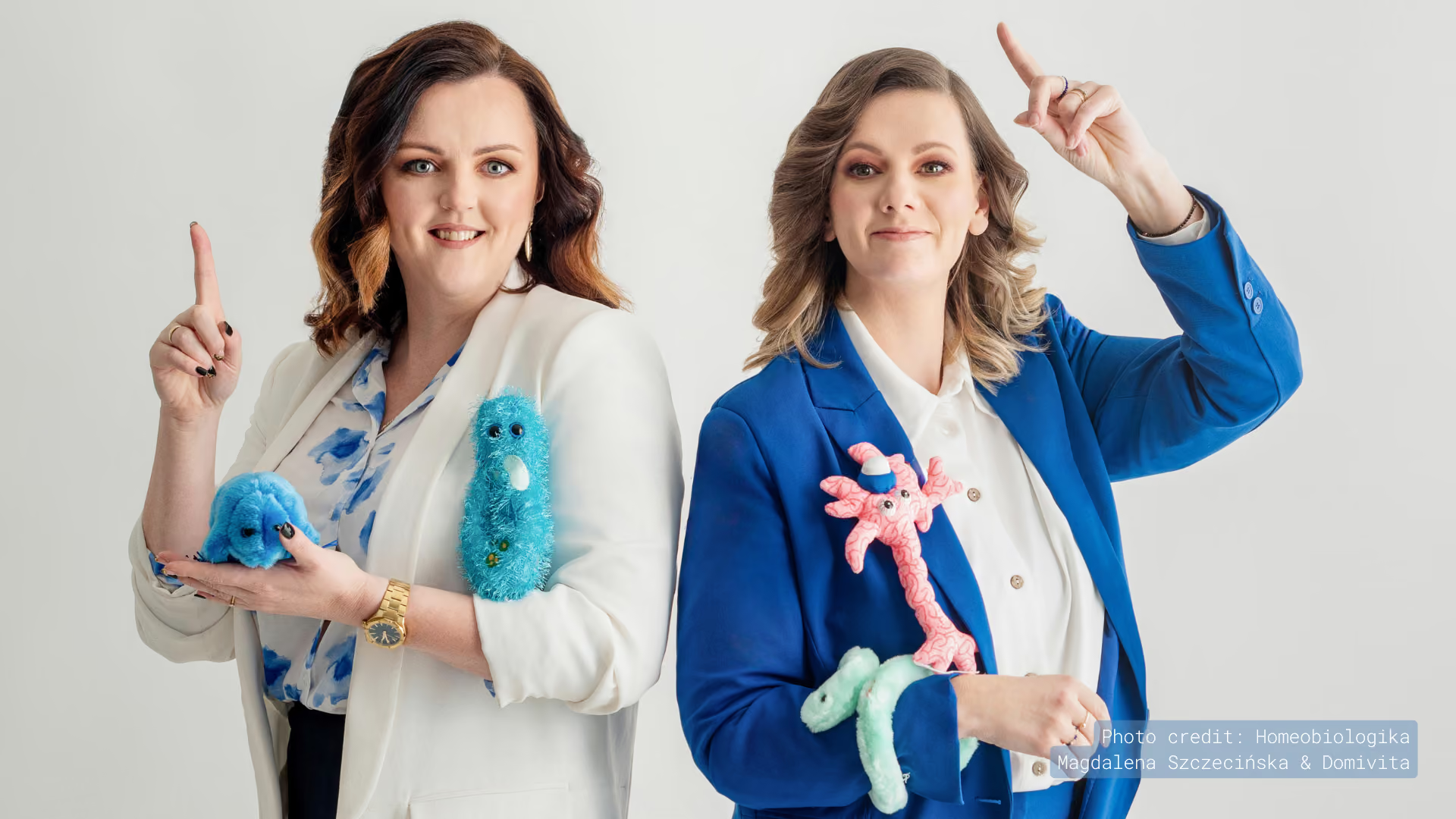
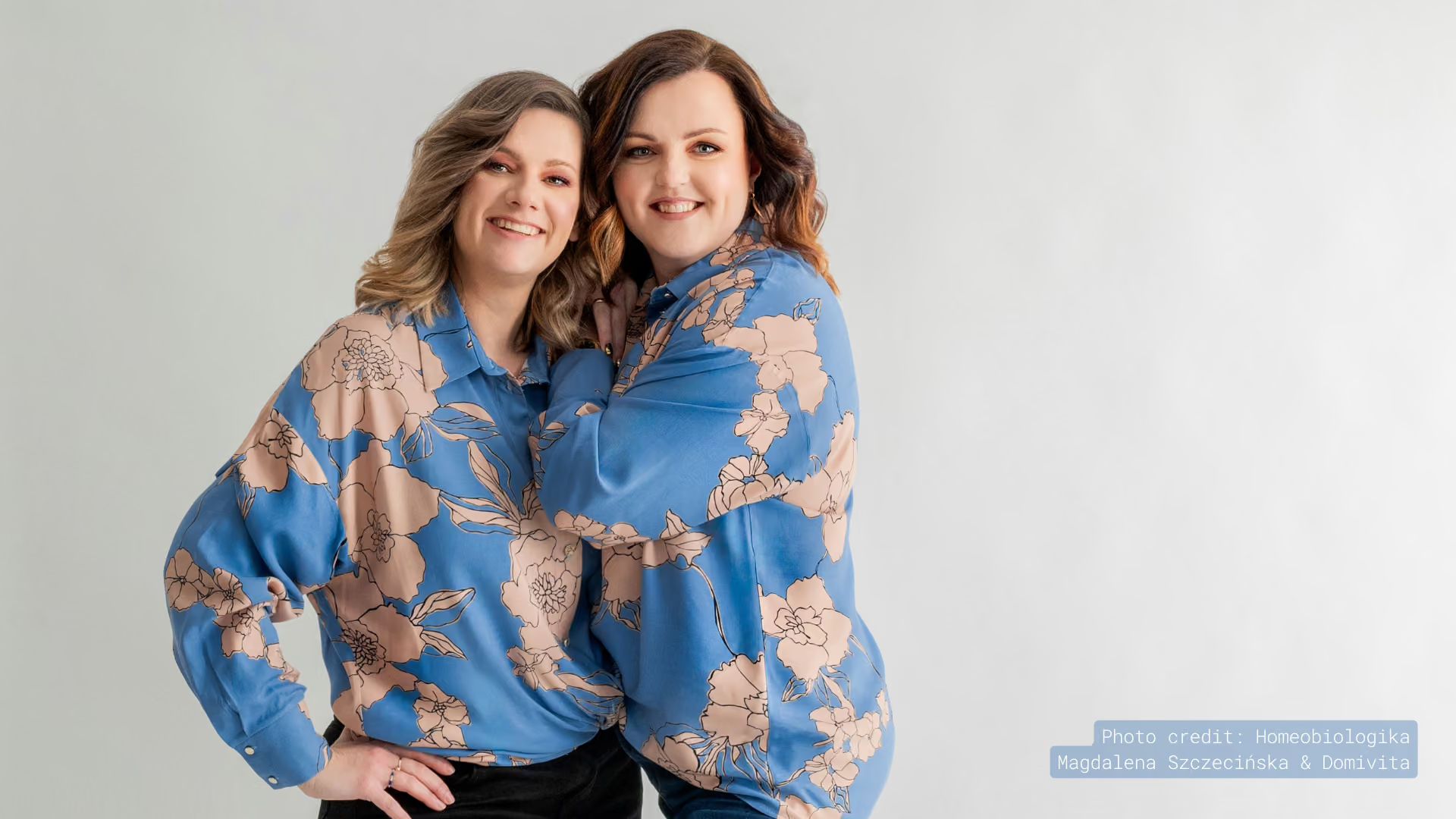
Magda Szczecińska and Dominika Tomczak are holistic health practitioners and the founders of Homeobiologika and DomiVita. Drawing on their work in homeopathy, total biology, and bioresonance diagnostics, they came together to create Ale draka mam robaka, a Polish-language e-book on deworming designed to help families make informed decisions about their health.
The Challenge
Homeobiologika and DomiVita came to us with a detailed manuscript filled with specialist knowledge, practical guidance, tables, and key takeaways. The content was valuable, but its volume and sensitive subject called for a thoughtful visual approach. Our challenge was to make the e-book clear without oversimplifying the material, warm without losing credibility, and structured enough to guide readers from beginning to end. Every design choice also needed to reflect the founders’ holistic perspective.
The Outcome
We transformed the text into a polished e-book with a clear structure and an inviting visual style. Carefully designed tables, content blocks, typography, and navigation elements make the information easier to scan and follow, while maintaining a consistent reading experience from the first page to the last. The finished guide makes a complex health topic feel more approachable and has received highly positive feedback, further strengthening our long-standing creative relationship with Magda.
How We Got There
Every layout decision began with one question: how can we make this easier to understand?
We started by reading through the text and looking closely at its natural rhythm. We identified the main sections, recurring content types, important takeaways, and areas that needed more visual breathing room. This gave us a clear foundation for the layout before we began designing individual pages.
Next, we developed a visual system that felt warm and approachable while still giving the content a professional structure. Typography, colours, tables, and graphic elements were designed to work together, helping readers recognize key information and move through the guide more naturally.
Once the visual direction was in place, we focused on consistency and flow. We adjusted spacing, content hierarchy, and page layouts to keep the e-book easy to scan without making it feel repetitive. Every detail was considered as part of one continuous reading experience.
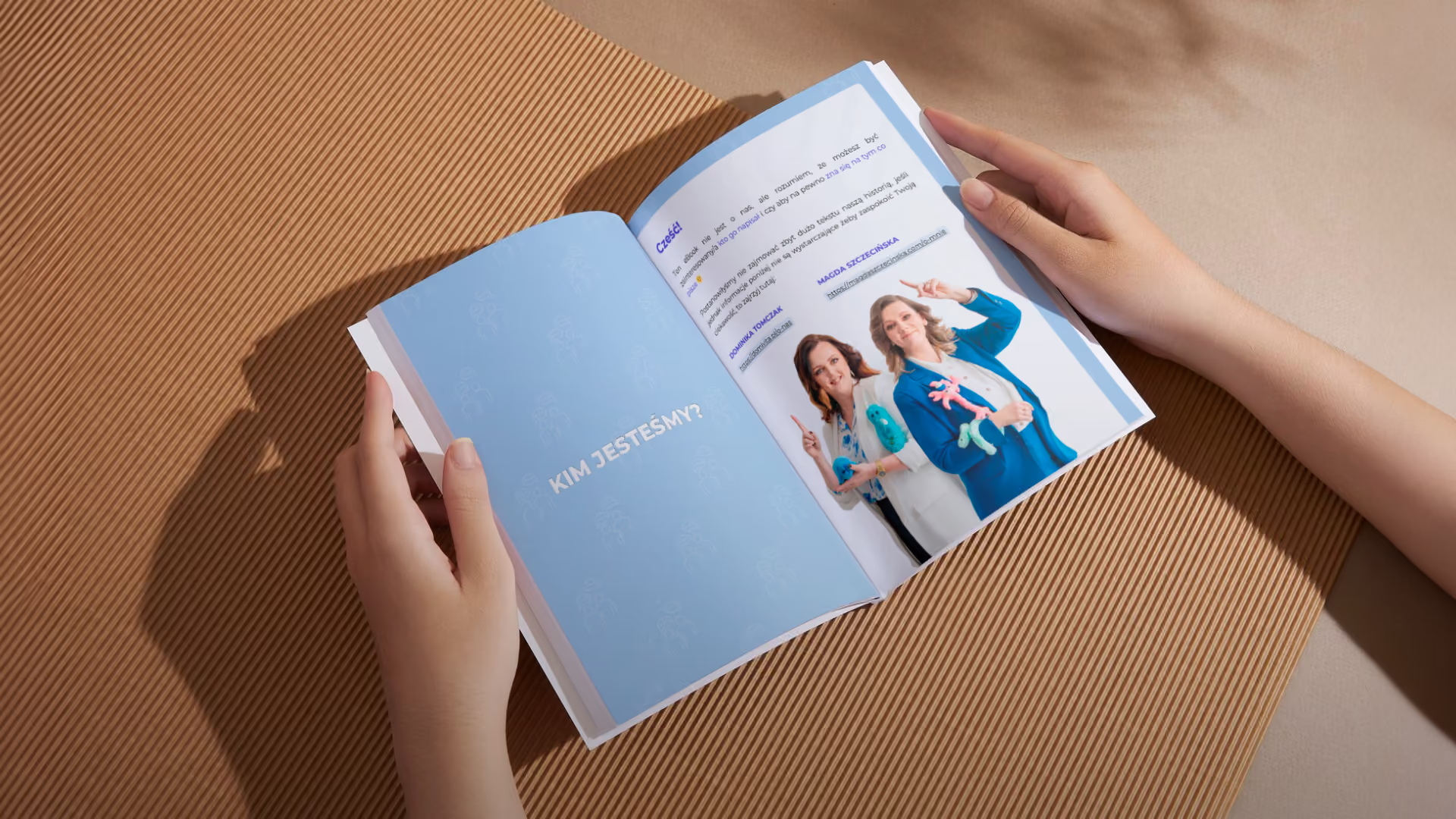
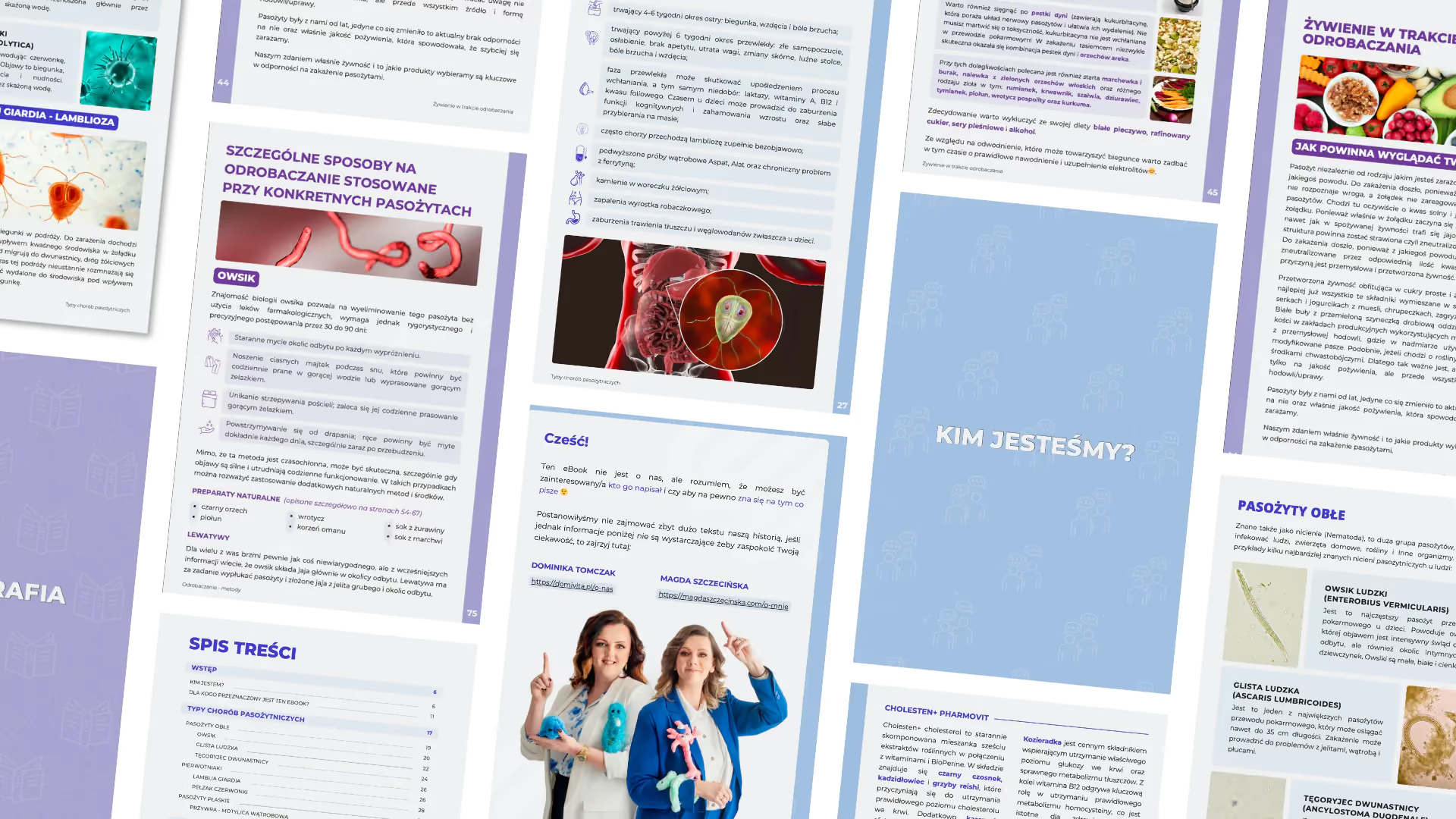
Digital Book Design
We shaped the full e-book with clear layouts, custom content blocks, visual tables, and an inviting reading flow.
A Final Thought
For us, good design meant making every page feel clearer and easier to follow.
We really enjoyed helping Magda and Dominika bring this guide to life. Our role was to give their knowledge a visual form that felt clear, warm, and genuinely theirs. The result is an e-book that handles a complex subject with care while giving families a reading experience that feels approachable from the first page.